Brand Strategy · Identity · Campaign · Global
Afterpay.
Client
Afterpay
Scope
Brand strategy, identity and campaign
Scale
25,000+ retail merchants
Tagline
Love The Way You Pay
01 / Brand Positioning
Own the word Pay. Not just as a transaction. As a feeling.
Afterpay was growing fast but the category was filling up. Openpay, AirPay, PayBuy, ZipPay — every new entrant had pay in their name. The strategic opportunity was hiding in plain sight. What if Afterpay owned the word Pay itself — not just as a financial term but as an emotional one? When you pay a compliment, pay your respects, pay it forward — there is no money involved. Pay has depth. That insight became the foundation for everything.
“Sometimes there’s hell to pay. Other times we pay our respects. We pay attention to what’s important to us. It pays to listen. It pays to learn. It pays to love. When we pay we connect with what makes us happy.”
Brand strategy document, 2019
Active customers at time of rebrand
Active retail merchants
US, UK and beyond
02 / Positioning Work
Love The Way You Pay.
Through deep research of use cases and customer feedback we articulated a brand strategy that reflected where Afterpay had found itself and where it placed its future vision. All captured in the Afterpay Brand Book — informing all stakeholders domestically and globally.
03 / Lifestyle Photography
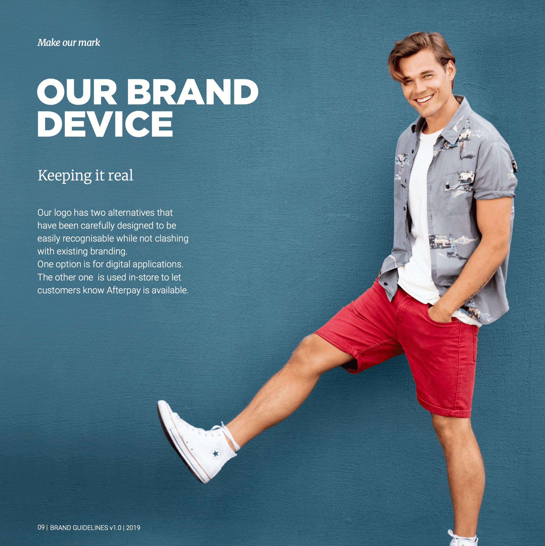
A brand that looks like the life you want to live.
The lifestyle photography direction put real people and real moments at the centre of the brand — not products, not transactions. Shopping as a joyful act. Paying as something to feel good about.






04 / Brand Assets
From a simple logo to a complete visual identity.
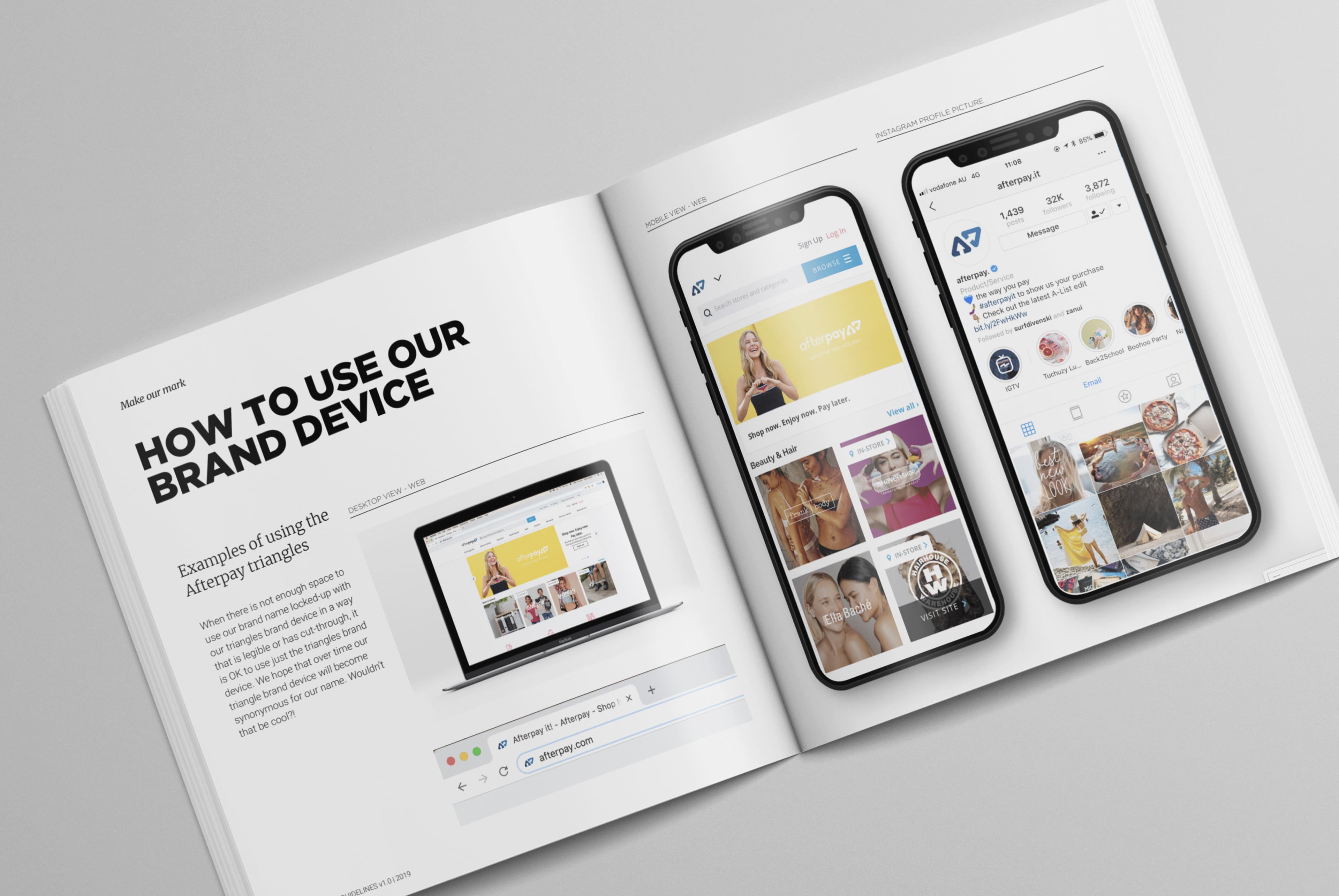
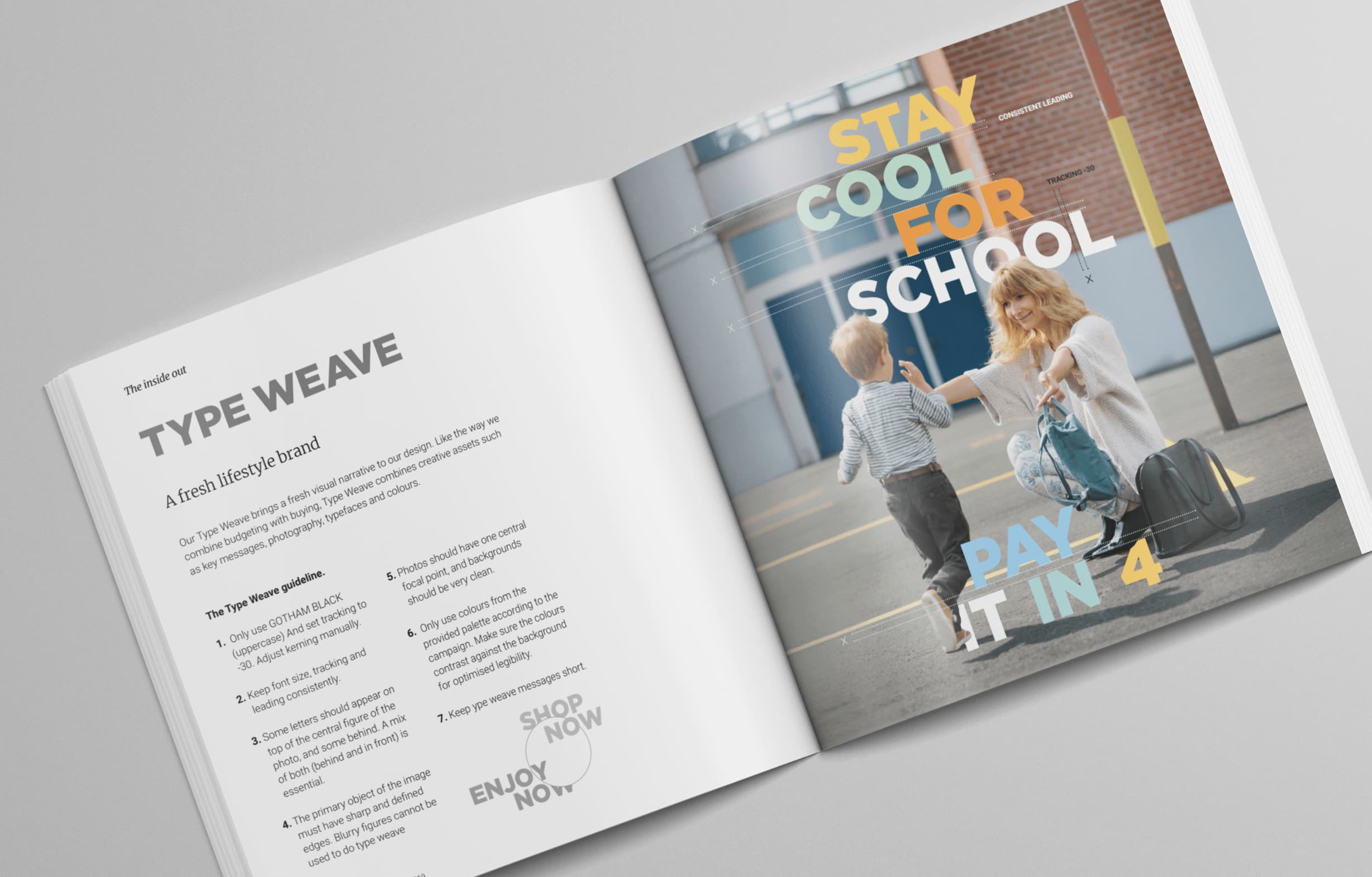
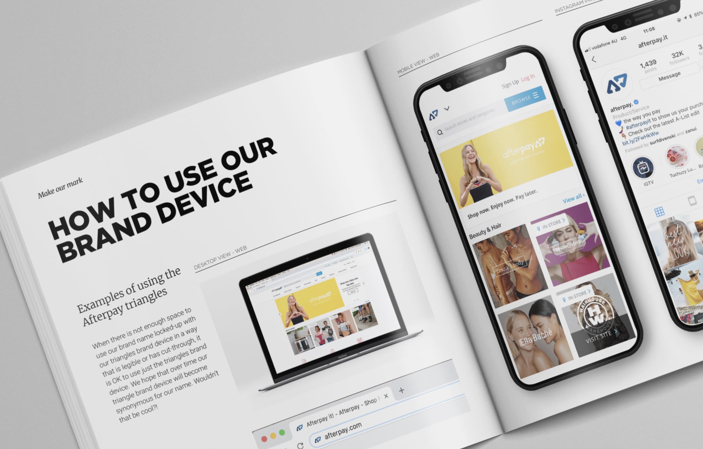
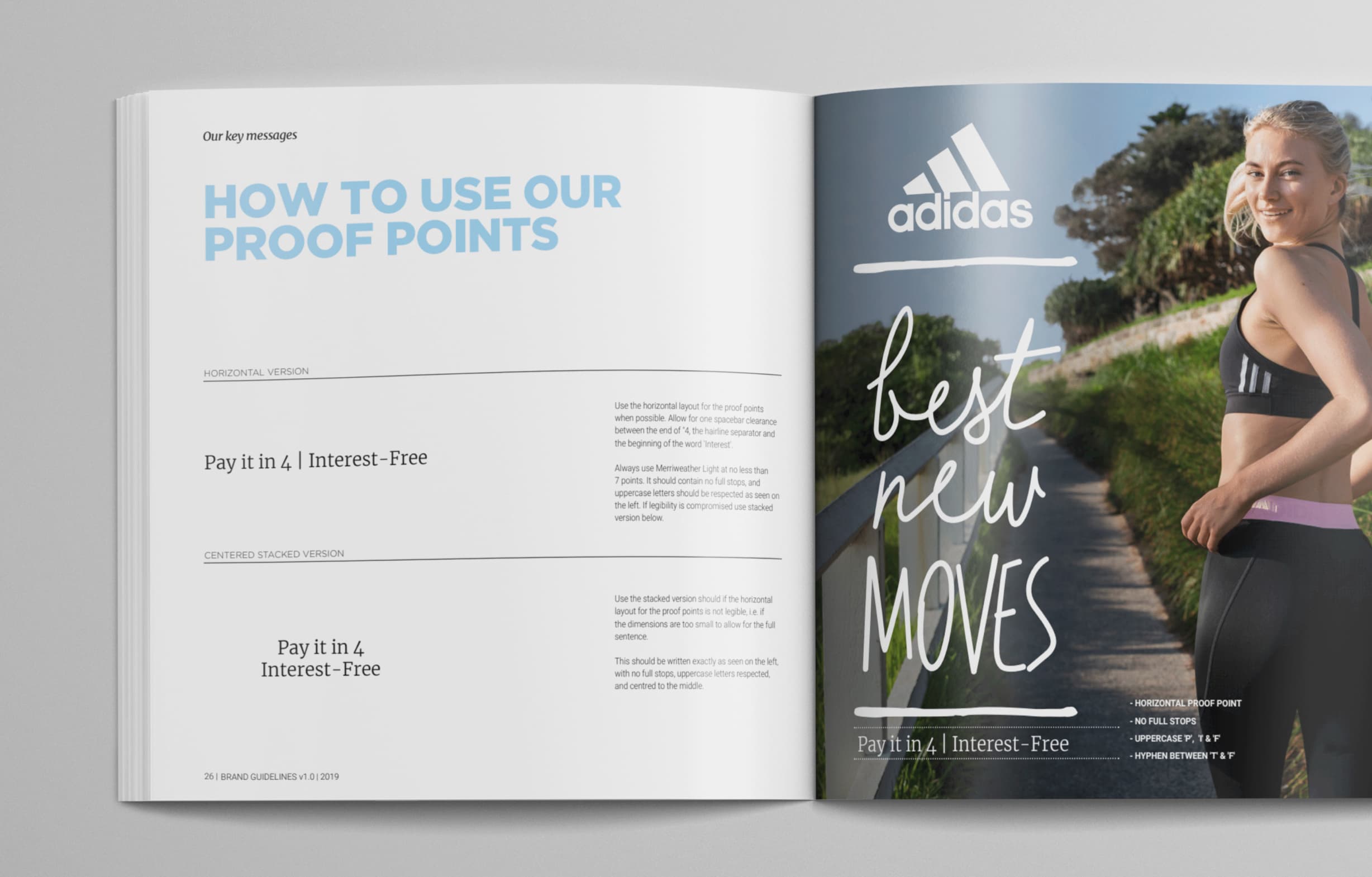
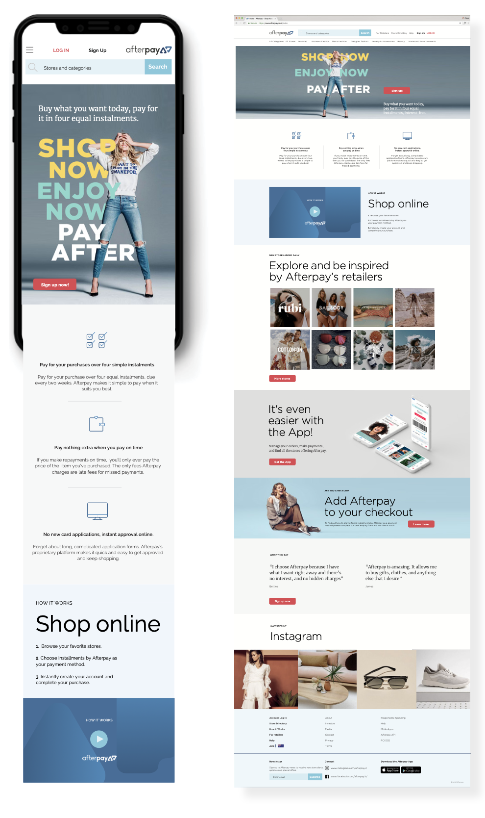
The Afterpay Brand Guidelines evolved the brand from its original mark into a full visual system — covering colour, typography, photography, digital and retail applications. Every touchpoint, consistent.

05 / Brand Book
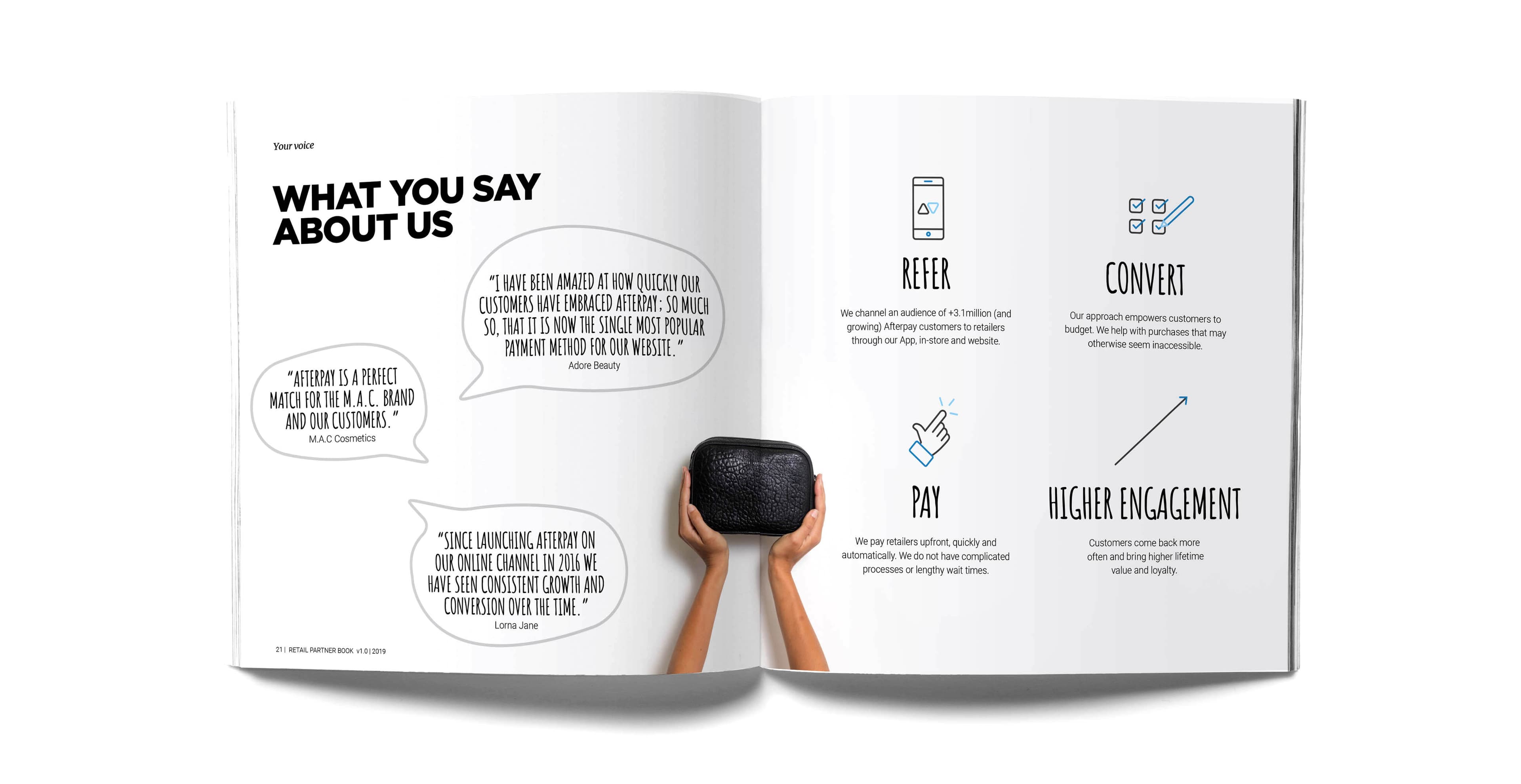
The Brand Book. And the Retail Partners Book.
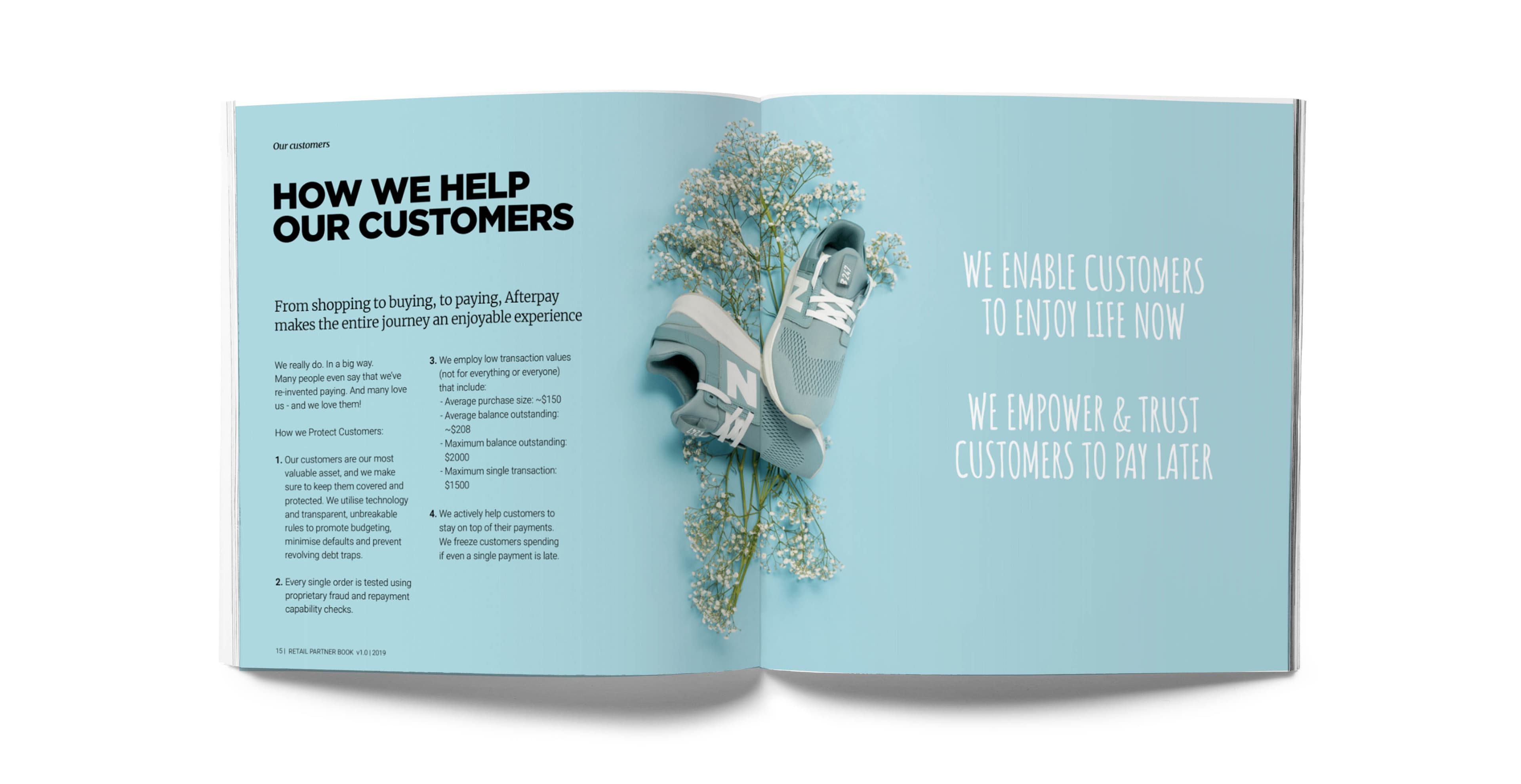
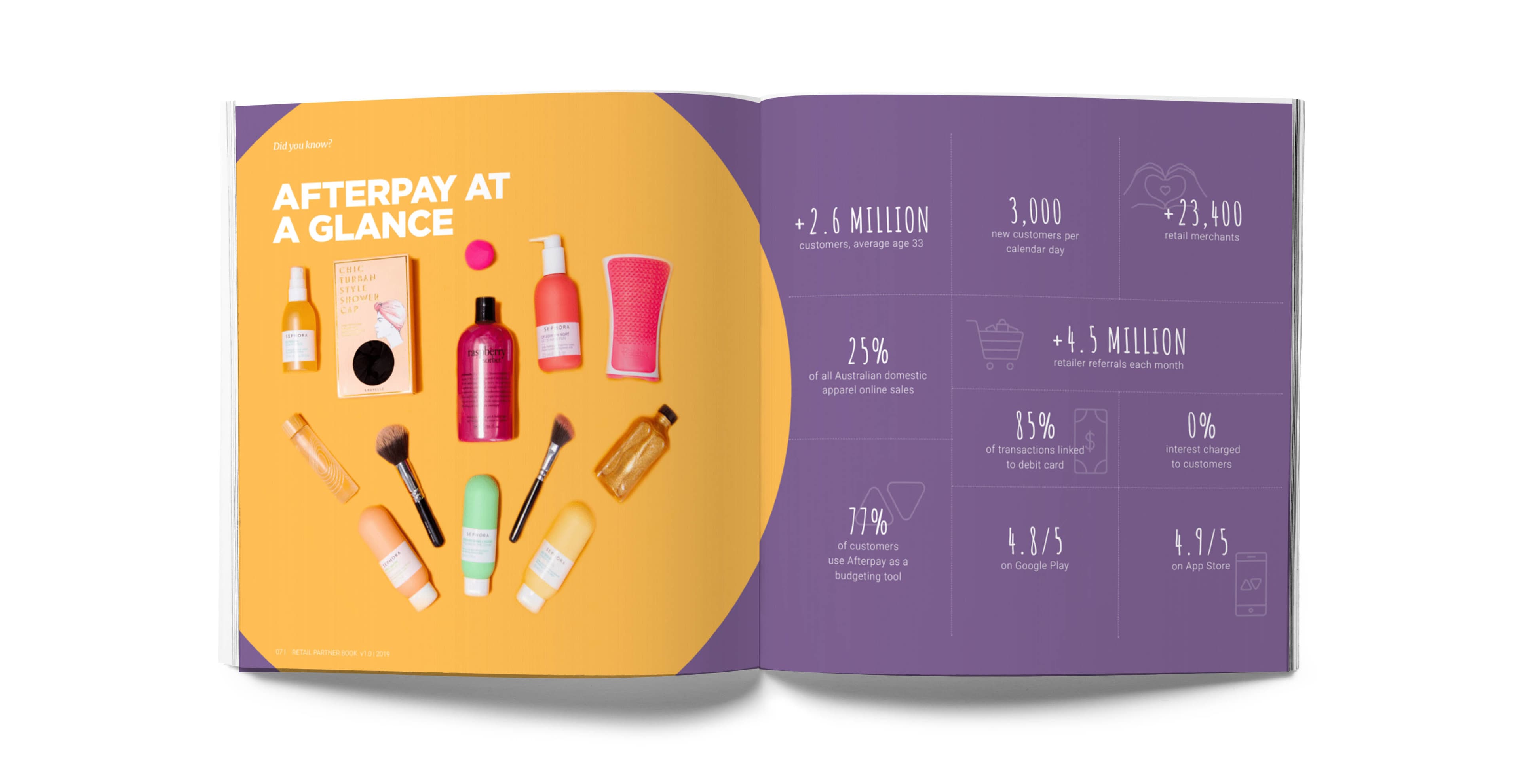
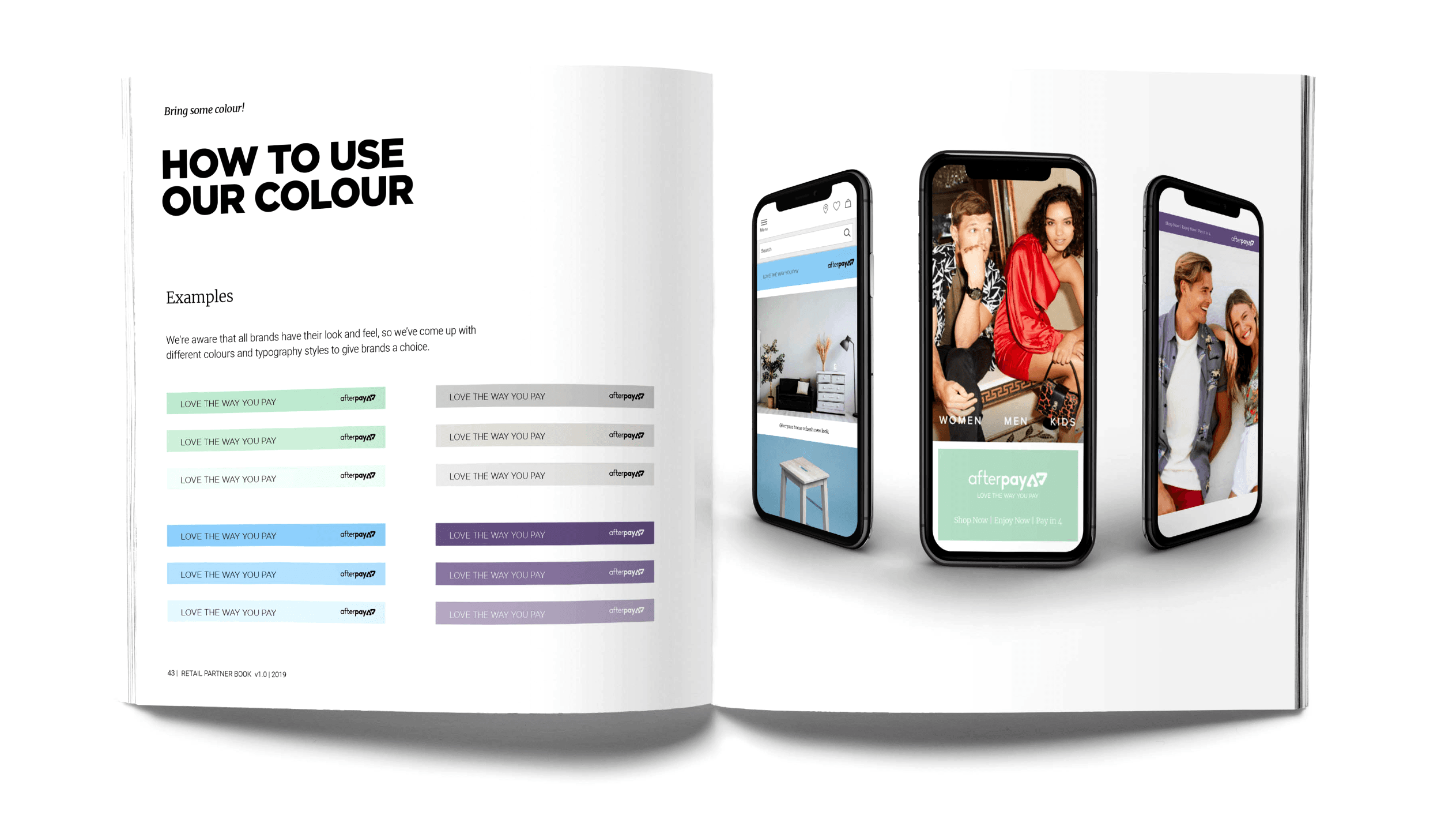
The Afterpay Brand Book captured the full brand strategy and visual identity for all stakeholders domestically and globally. The Retail Partners Book was distributed to 25,000+ merchants — giving every partner the tools to represent the brand correctly in-store and online.
06 / Campaign
Afterpay’s first campaigns in market.
We created and deployed Afterpay’s very first digital marketing campaigns globally — behind-the-scenes content and brand video with retail partners including Smiggle, Big W, Officeworks, Adidas, Bonds and Hairhouse Warehouse.
Smiggle | Big W | Officeworks | Adidas | Bonds | Hairhouse Warehouse | Athletes Foot
07 / New Brand Direction
A new global brand. Built to own Pay.
Working directly with co-founder Nick Molnar, a new global brand direction was developed to take Afterpay into the US, UK and beyond. The challenge was clear — as competitors multiplied, every new entrant used pay in their name. The strategic opportunity was to make that work for Afterpay, not against it.
Colour System
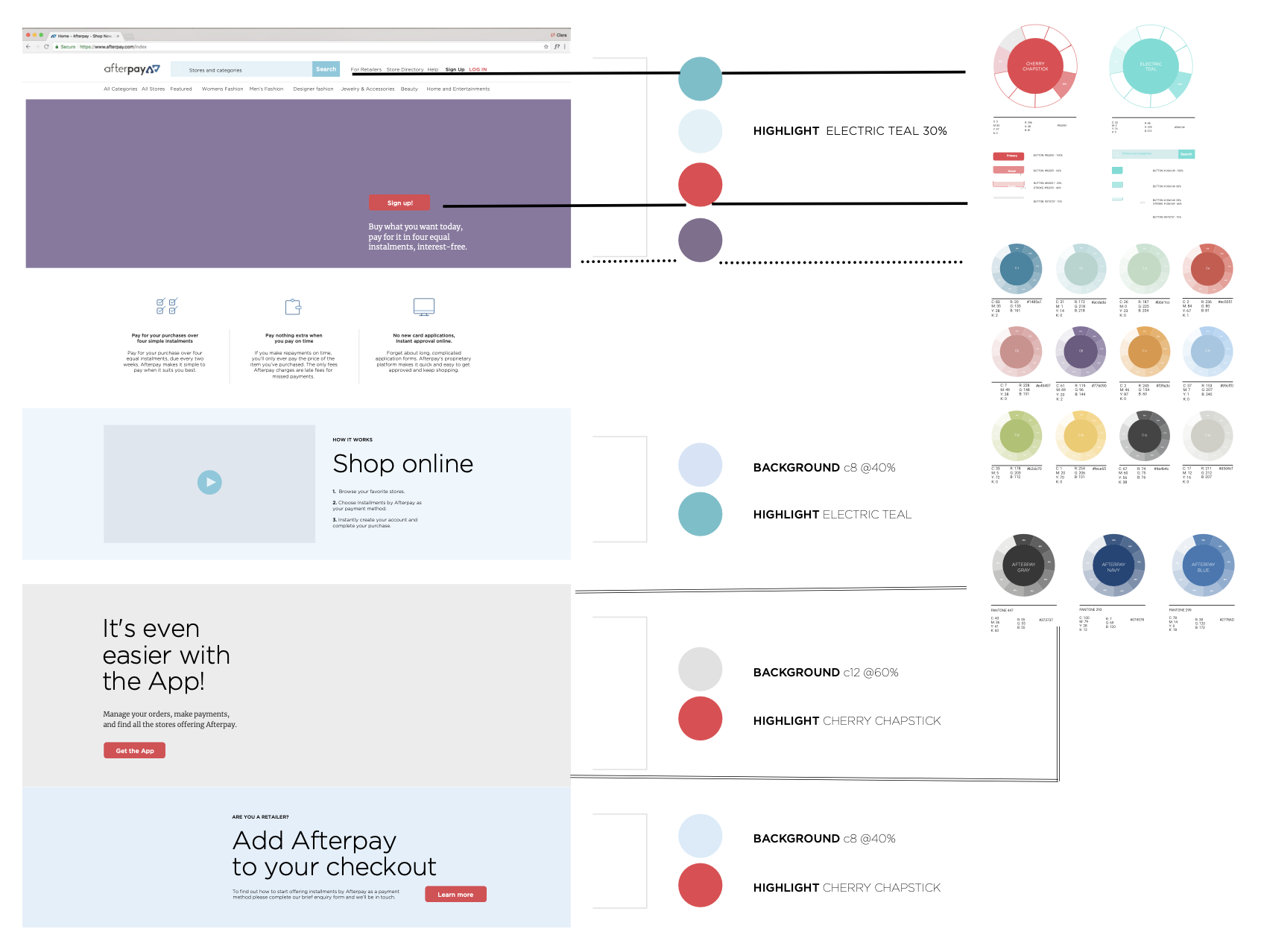
Every colour tied to an emotion. Midnight Blue for emphasis and clarity. Tuscany for warmth. Bondi Blue for energy and distinctiveness in a category dominated by sterile fintech palettes.
The CircleDot
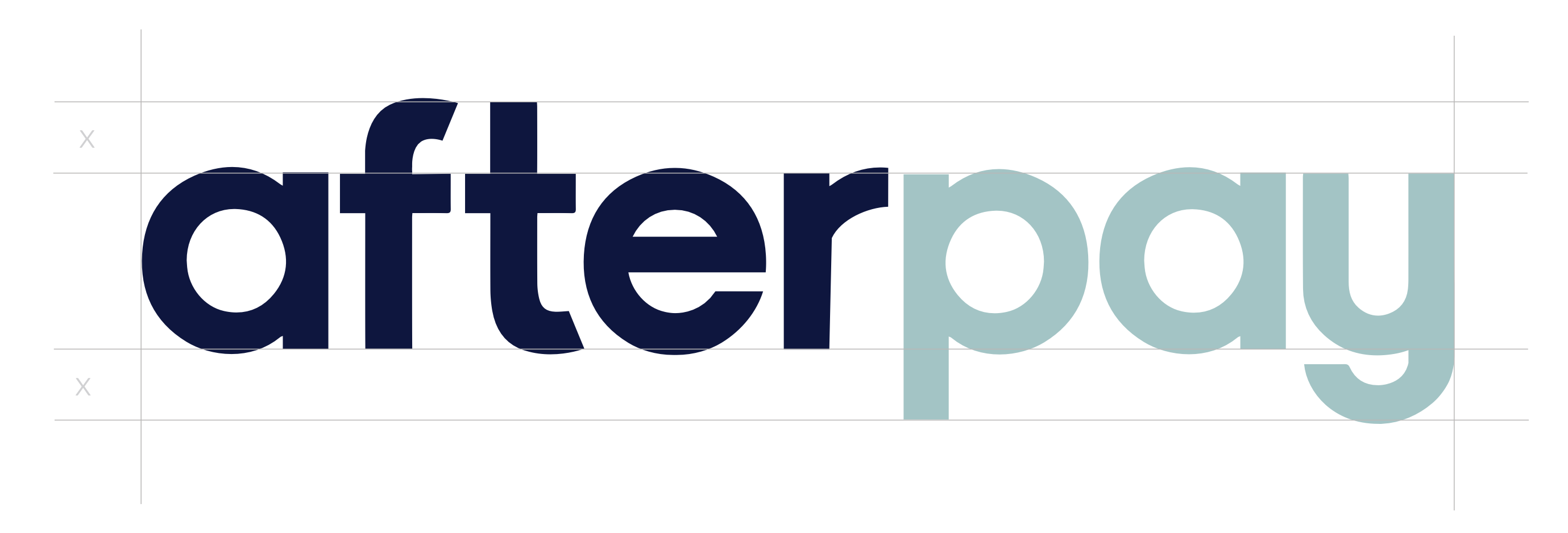
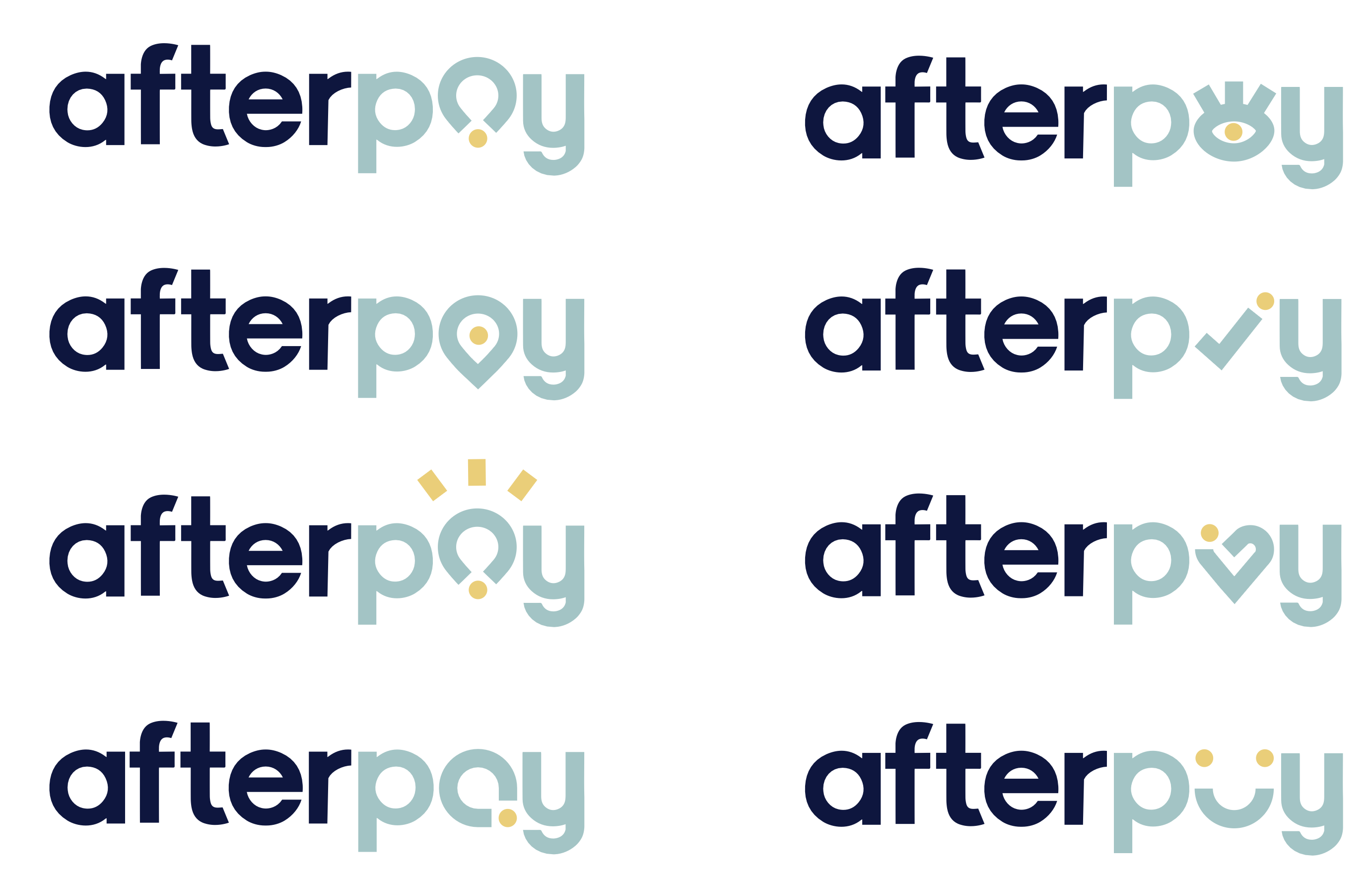
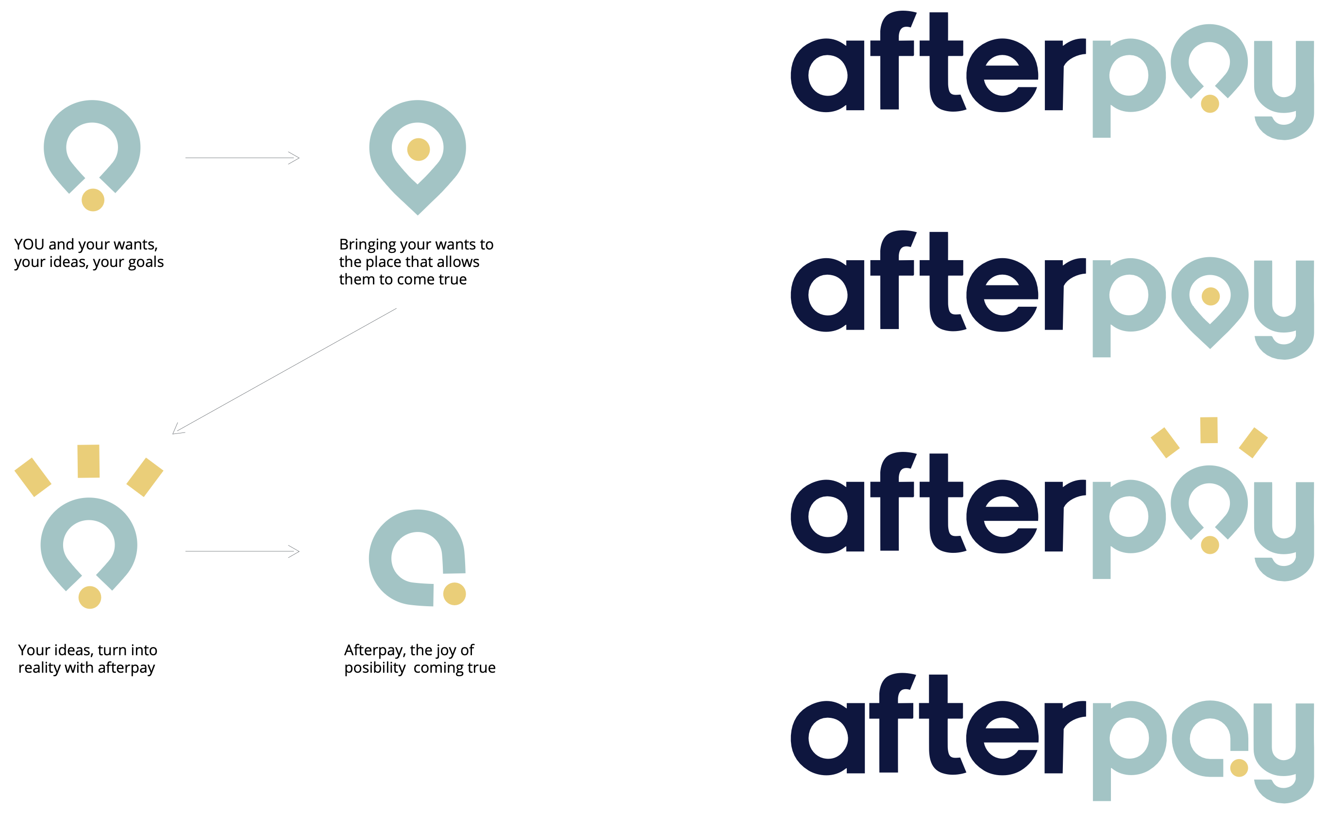
The CircleDot device forms the ‘a’ in Pay and stands alone as the Afterpay and Clearpay mark. It can rotate and morph to become a heart, a smile, an idea, a thumbs up. Just as Pay carries multiple meanings, the CircleDot can stand for all of them. By owning the CircleDot and building on the many meanings of pay, a clear path to Afterpay owning the entire category can be seen.
08 / New Brand Identity
The CircleDot. A mark built for the world.




09 / Colour Systems
Owning a feeling. Not just a palette.
By building a powerful emotive connection to the word Pay — and backing it with a colour system that felt warm, human and unmistakably Afterpay — the brand could move beyond category building into genuine emotional ownership.
10 / Outcome
The brand was ready before the market was.
Retail merchants reached
Active customers
US, UK and beyond
Global digital campaigns in market
The Love The Way You Pay positioning gave Afterpay a platform to grow confidently — differentiating from the growing field of competitors by owning the emotional territory around the word Pay itself. The new brand direction took that further. The transition to the US brought complexity and only parts of the vision were ultimately adopted. But the strategic thinking left its mark on everything that followed.
Brand strategy, Brand book, Brand guidelines, Retail partners book, Lifestyle photography direction, Digital campaigns, In-store collateral, New brand development, CircleDot identity system