Brand Identity · Fashion · Digital
Boody.
Client
Boody Eco Wear
Scope
Brand identity and digital
Material
Bamboo viscose
Category
Sustainable fashion
01 / The Challenge
A brand built for pharmacies trying to compete in fashion.
Boody had built a loyal customer base selling through pharmacy outlets but the brand wasn’t keeping pace with their ambitions. The original B icon — a play on a bum — was appearing in too many places and had lost its impact. The typography was compressed and dated. The fashion photography lacked the sophistication the product deserved. A bamboo fabric that is genuinely more comfortable than cotton needed a brand that communicated that truth with confidence.
The Problem
Overuse of the B icon, compressed typography, and fashion photography that didn’t reflect the quality of the product or the values of the brand.
The Opportunity
A genuinely unique product — bamboo viscose, unmatched breathability, supreme softness — that needed a brand as considered as the material itself.
02 / Brand Identity
Restraint as a brand value.
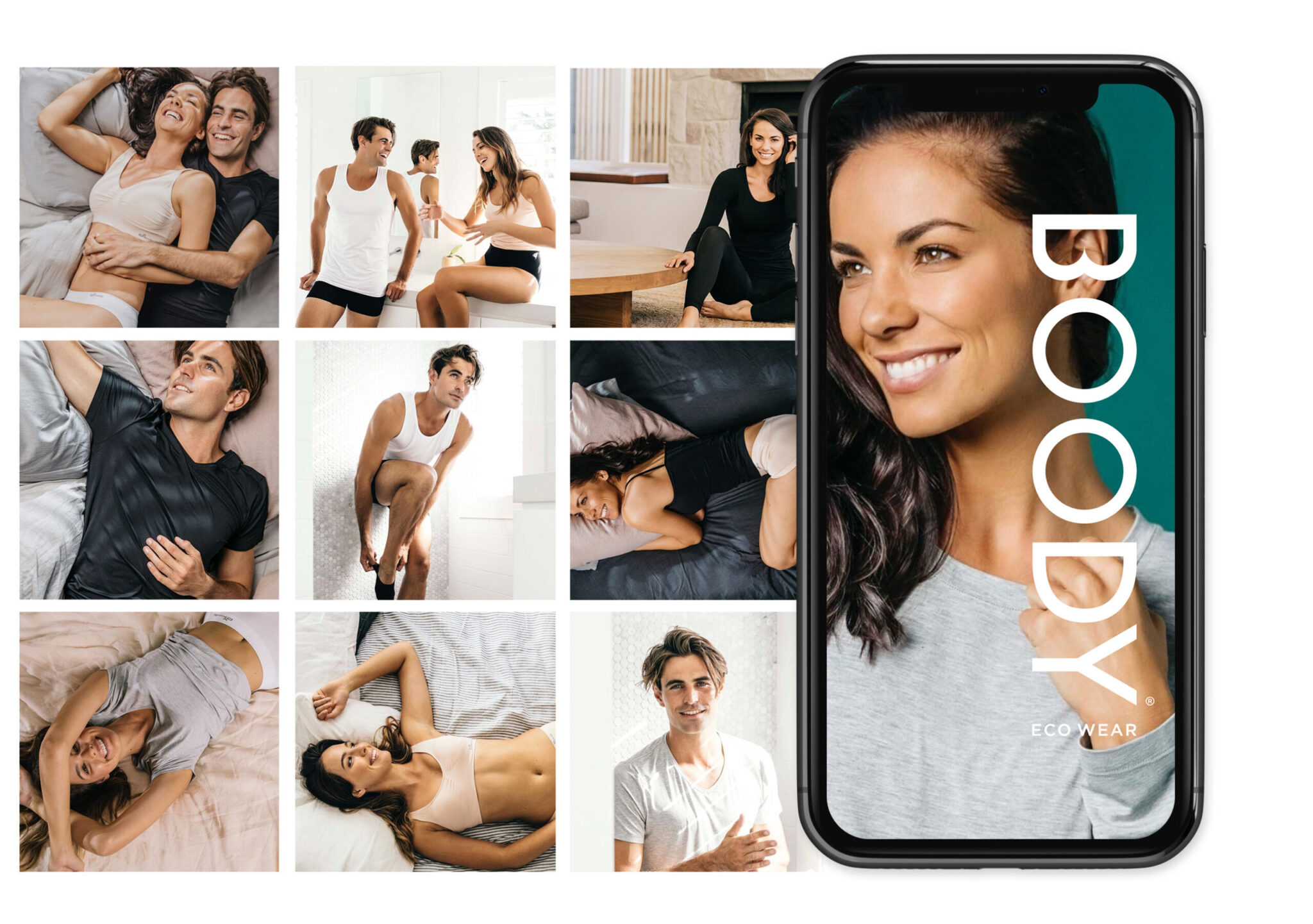
The rebrand pulled back. The B icon was refined and used with more discipline. Typography was opened up — giving the brand the breathing room it needed to sit confidently in the fashion space. The colour palette stayed warm and natural, reflecting the bamboo material at the heart of everything. Less clutter, more confidence.
03 / Brand Book
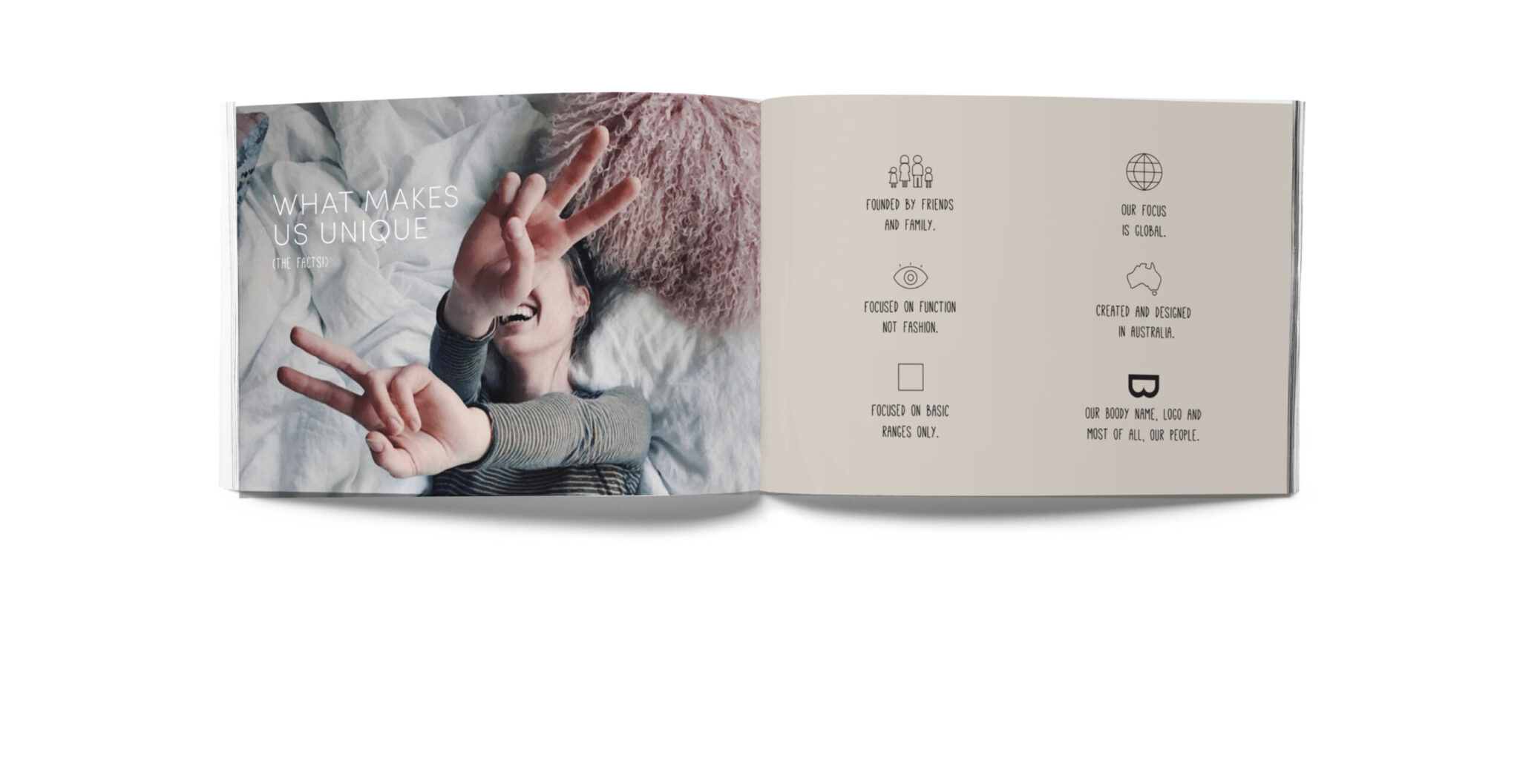
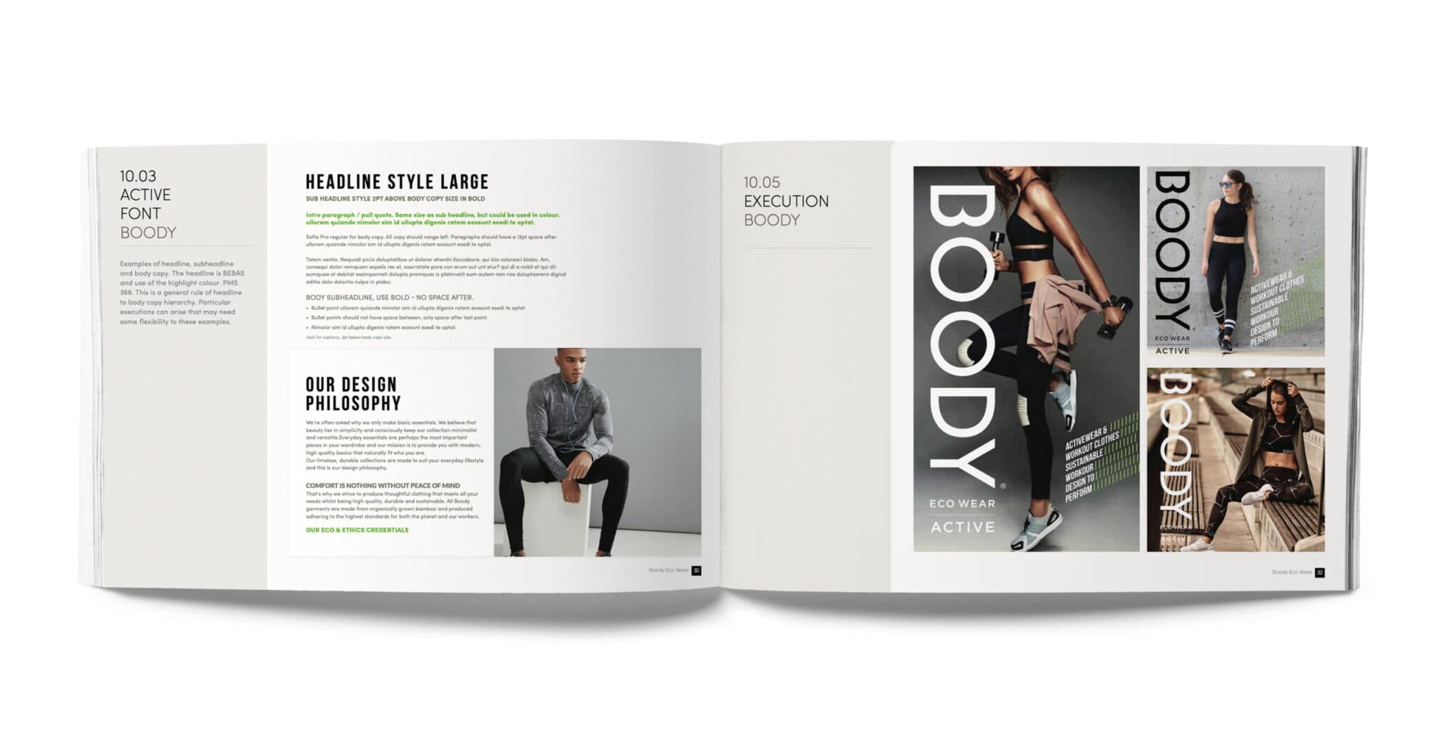
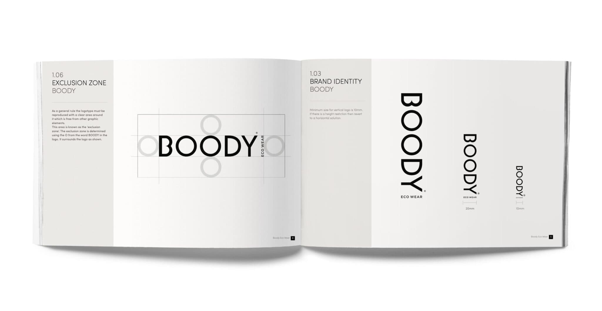
Everything in one place. Nothing left to chance.
The Boody brand book set the rules for how the brand looked and felt across every touchpoint — giving the internal team and retail partners a clear system to work from.
04 / The Story
We got uncomfortable, so you could get comfortable.
Uncomfortable with wires. With awkward seams. With bras you wanted to take off as soon as you walked through the door. Uncomfortable with fast fashion and trend-led designs. With straps and waistbands that dug in. With sweaty fabrics and unnecessary fuss. So instead — wire-free, seam-free, stress-free. Bamboo viscose. Unmatched breathability. Supreme buttery softness.
“Bamboo viscose. Unmatched breathability. Supreme buttery softness.”
05 / Photography and Digital
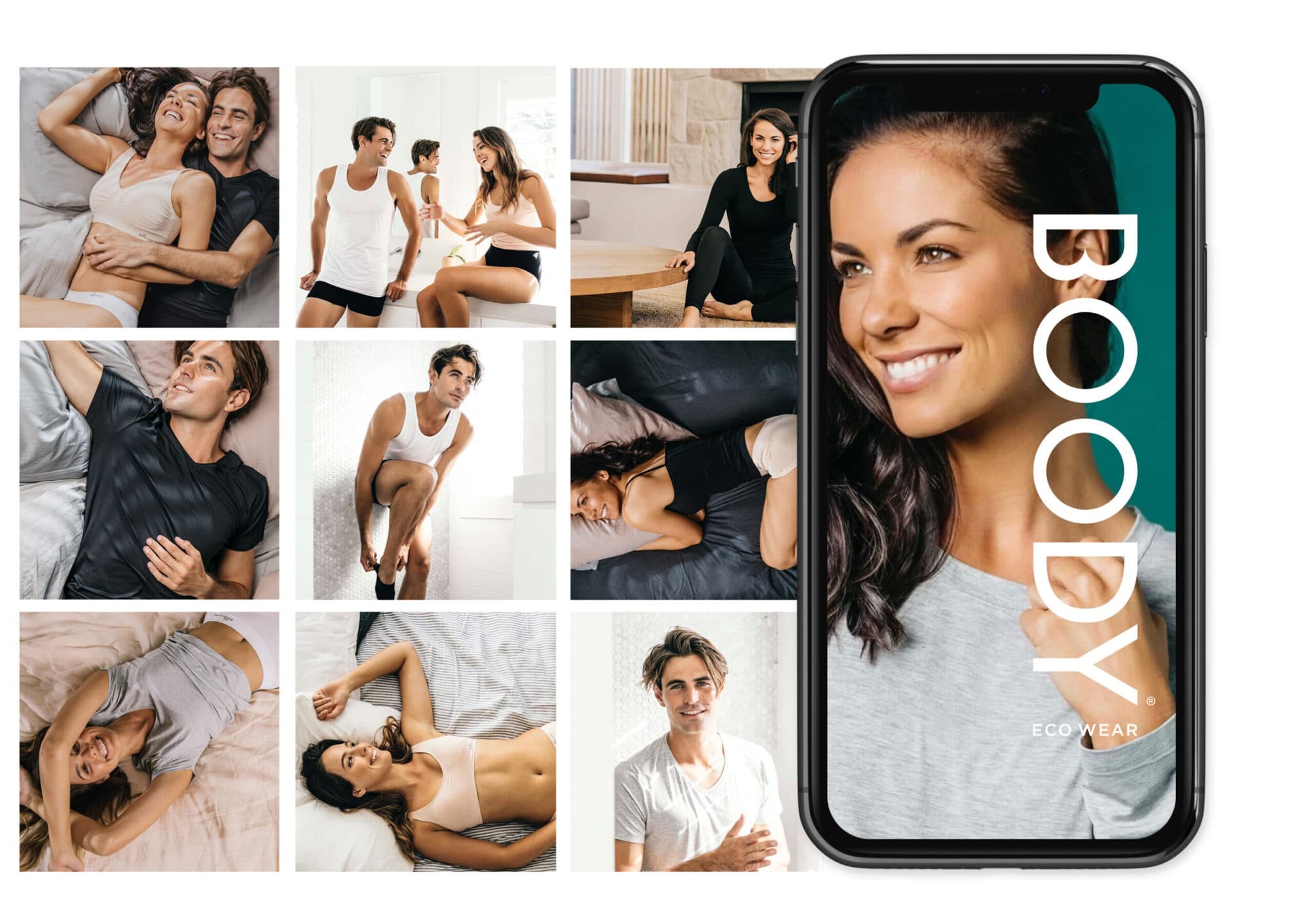
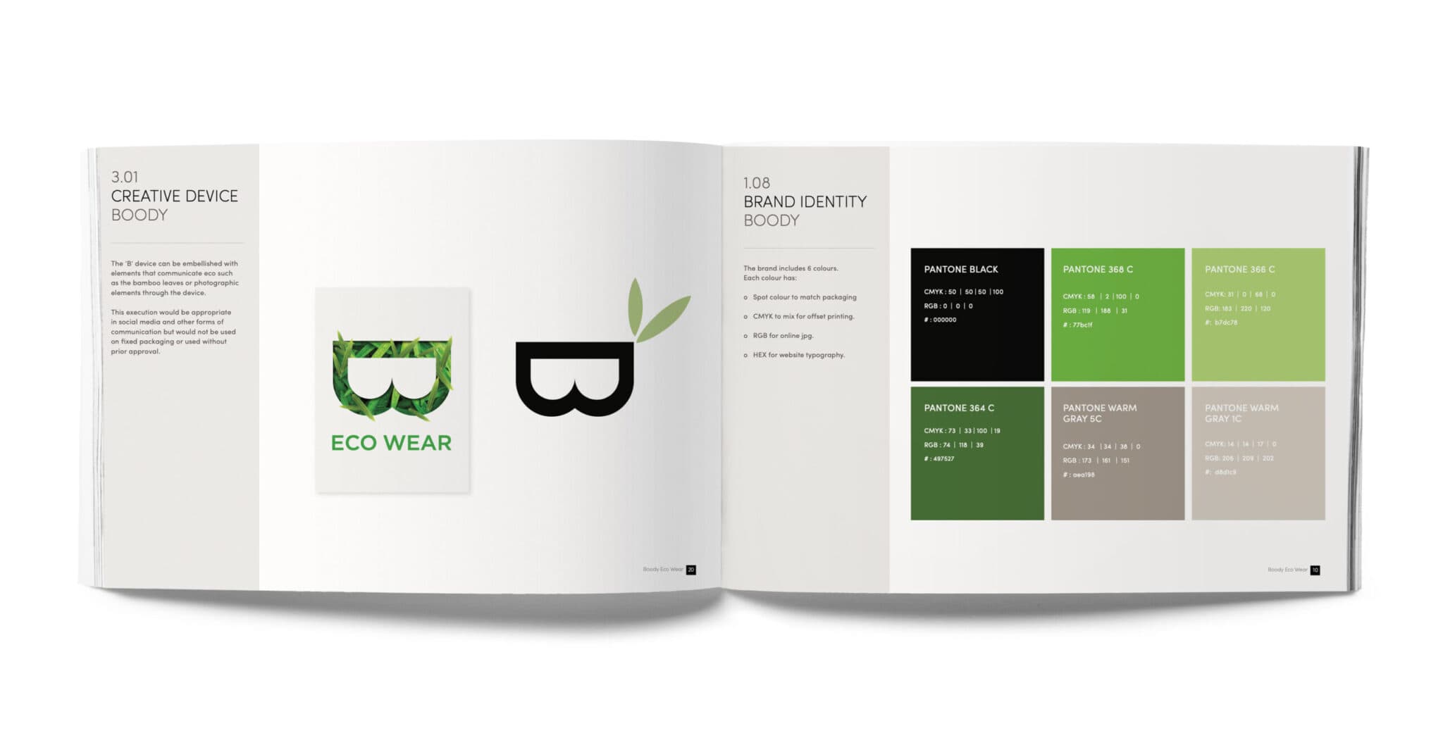
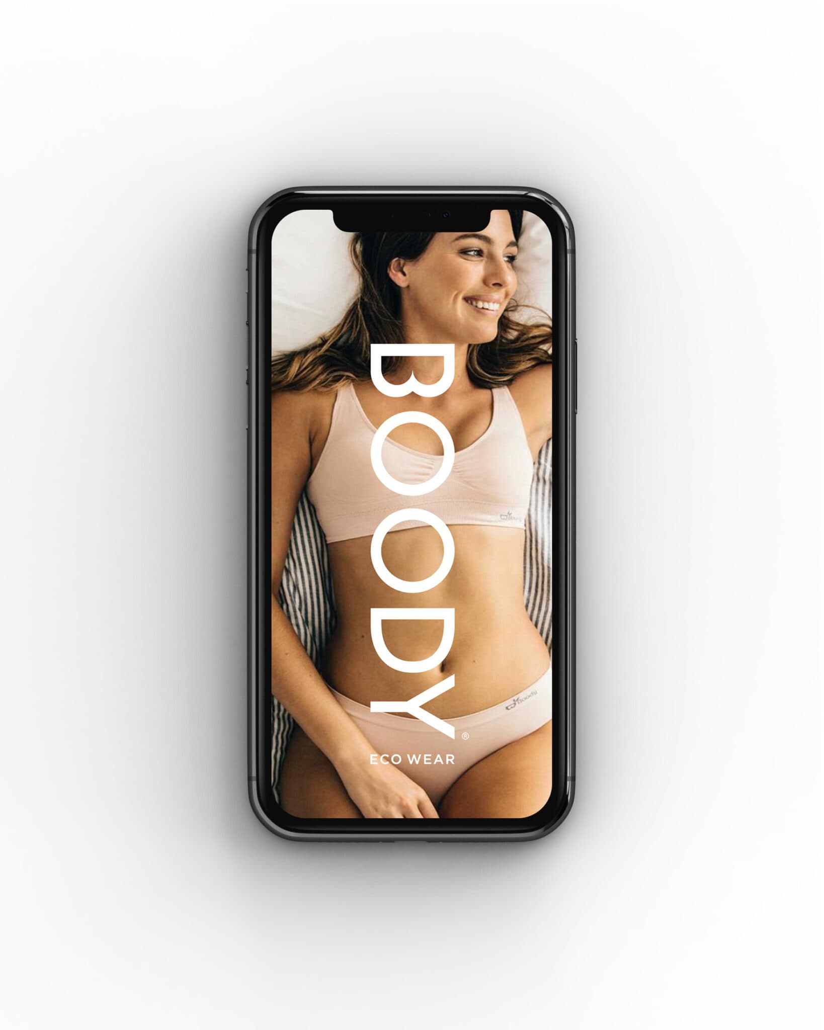
Fashion photography that tells the real story.
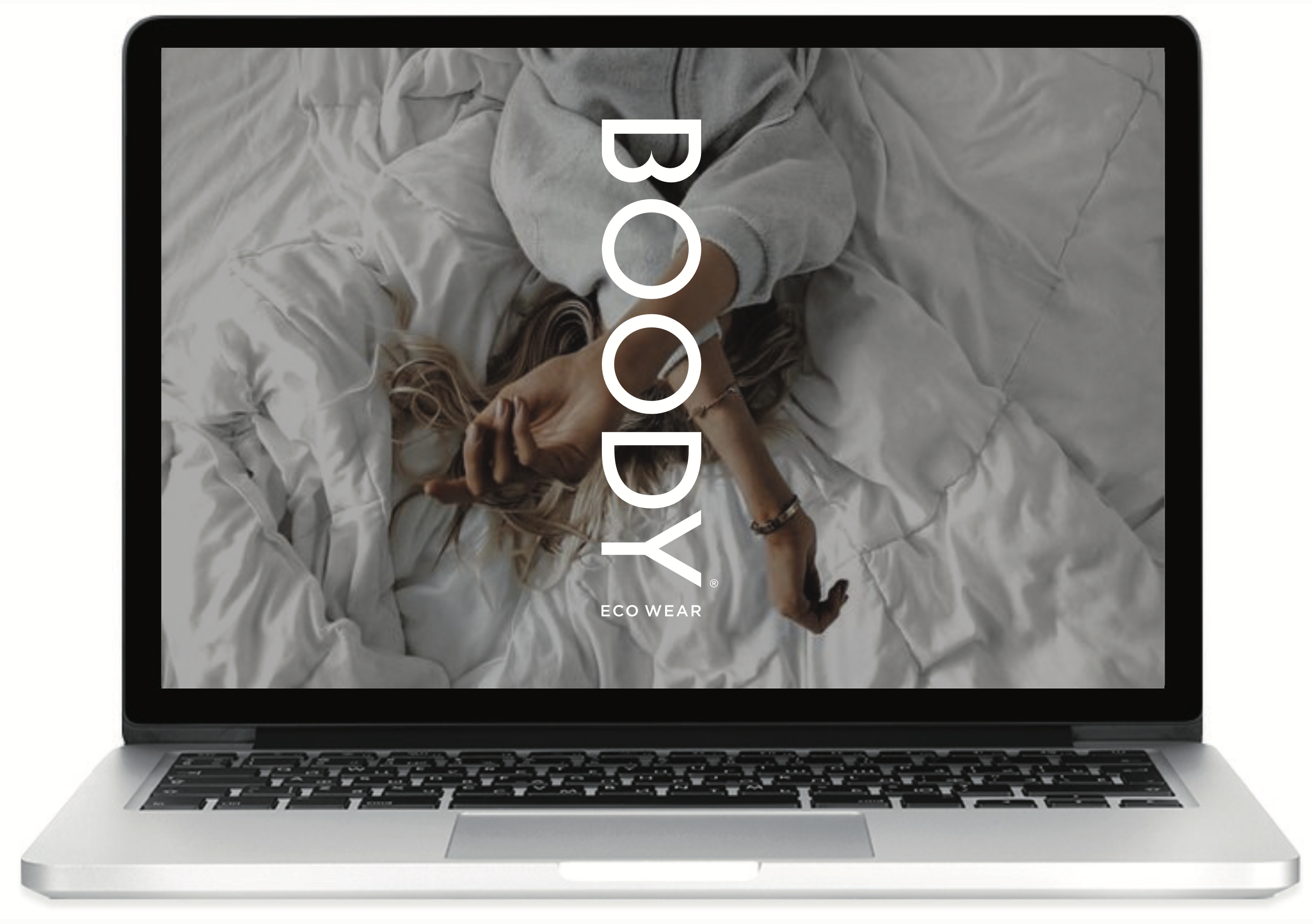
The photography direction moved the brand firmly into fashion territory — clean, confident, product-forward. The digital execution carried the same restraint, letting the product and the people wearing it do the work.
Bamboo. Not cotton.
Bamboo viscose is genuinely different — softer, more breathable, more sustainable. The brand needed to communicate that difference clearly and confidently. Not as a trend. As a truth.
06 / Outcome
A brand ready for fashion. Built on something real.
Brand identity and icon
Photography direction
Product and campaign execution
The material truth at the centre
The Boody rebrand gave a genuinely innovative product the visual confidence to compete in the fashion and lifestyle space. By pulling back the brand system — refining the icon, opening up the typography, elevating the photography — the brand became as considered as the material it was built on.
Brand identity, Logo refinement, Brand book, Brand guidelines, Photography direction, Digital execution, Campaign assets